This is my weekly reflection for the week of April 25th.
I'll be showing you my brochure design for my InDesign composite project. It features my fake company, The Honey Thieves!
Click for a better view!
I wanted a predominantly golden theme. I tried to alternate between two different golden colors for each panel for variety. I included some hexagons. Although they were extremely easy to make, I think they add a lot to the layout and design.
The little hand drawn bee was indeed hand drawn. I used it in a previous assignment (I made a pattern brush with it). I use it here in a similar manner. It makes for a cute yet simplistic decorative border on the inside of the brochure. It adds a bit of flavor to the front and back of the brochure as well.
When choosing images for the inside of the brochure, I wanted images that worked well together. Amazingly, I found three images of different bee products all laid against a nice white background. It's like they were made to be together.
The images of the honey bees and the bee products are not my own. However, I did make the cell soap advertisement in Illustrator for assignment 11 (along with my awesome hand drawn bee).
I tried to keep everything very simple. There's only three colors in the brochure (brown, dark gold, and light gold). I tried to used an easy to read font that was not too stylistic. I want people to think that simple is good - The Honey Thieves want their products to be all natural, no artificial ingredients added. Plus, you don't have to be showy or expensive to have great quality. The Honey Thieves provide high quality products for great prices!
Monday, April 25, 2011
Wednesday, April 20, 2011
Assignment 17: Brochure Reflection
This Maxim Resources Inc. brochure is a half-fold brochure. It appears to be an oil and gas producing company, as is evidenced by the images and some of the text (which is a little hard to read). This may be an "Answer the Query" type of brochure to answer questions that consumers may have about the company or a "Sales Kit" type used to promote their product.
Line: Explorer Turned Producer
The line shows this company in a positive light rather than a negative light, as oil drilling is not really the most environmentally-friendly activity.
Their company name is large and visible. They also make it a point to put Maxim Resources Inc. on many sections of this brochure to ensure that the customer remembers the name. I see at least five instances of the name on this side of the brochure.
I like the color scheme. The many shades of blue are very unifying and calming, perhaps trying to invoke pleasant thoughts about their company and their cause. A warmer color, like red or orange, might elicit a more negative response, so blue was a good choice. The images are okay - there is not really a positive or negative feeling associated with them. Suggestions? They could have shown some industrious workers or teamwork and communication as well to elicit more positive responses.
I like the use of a separating bar to create distinct "boxes" where they can insert text and images.
Sunday, April 17, 2011
Weekly Reflection
Weekly reflection for week of April 18th.
This image won't make sense to most people. I play World of Warcraft and raid with a priest named Sephur. I actually don't even know if he likes me. My guess is no. Just look at him!
Anyway, I used Adobe Photoshop to create this. I used about 6 layers total, one consisted of the preliminary sketch, another with a better sketch, a layer for the outline, and about three layers for color. Some use of the dodge tool, but not much. I handwrote SEPHUR to finish it off. Stared long and hard at a reference image of Sephur. Done with a tablet.
This image won't make sense to most people. I play World of Warcraft and raid with a priest named Sephur. I actually don't even know if he likes me. My guess is no. Just look at him!
Anyway, I used Adobe Photoshop to create this. I used about 6 layers total, one consisted of the preliminary sketch, another with a better sketch, a layer for the outline, and about three layers for color. Some use of the dodge tool, but not much. I handwrote SEPHUR to finish it off. Stared long and hard at a reference image of Sephur. Done with a tablet.
Saturday, April 16, 2011
Assignment 16A
SPCA Advertisement
Target Audience: Lonely people, probably older children or adults who are able to care for an animal.
Line: There’s no better friend. Adopt a dog.
Simple yet effective. Might also be considered the tagline in this particular advertisement.
Visual: The visual is emphasized, the text is short and brief (“big visual, small type”). It shows a girl who is clearly saddened (apparently by a sad movie) being comforted by her pet dog (which is handing her a tissue). Both are enjoying a movie snack together. Ad type: slice of life/demonstration?
Body copy: None.
Product shot: If one can consider a dog as the product…
Tagline: Adopt a dog? One could argue that there is no line in this advertisement, just a tagline.
Improvements: I think I would have posed the dog doing something that dogs actually DO for people, rather than have a dog with anthropomorphic characteristics (sitting up, eating ice cream, offering a tissue). I understand that they are emphasizing that dogs are “friends,” but the truth is that dogs aren’t people.
Thursday, April 7, 2011
Weekly Reflection: T-Shirt Design
Can we call this my reflection for the week of April 11th? I know I already posted this week...
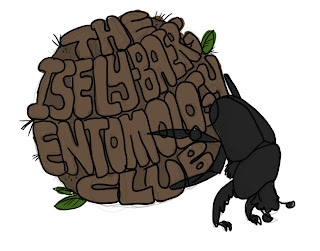
The Isley-Baerg Entomology Club wanted a t-shirt design. While doing some mundane task, I came up with an idea. What if we had a dung beetle pushing a ball of dung that had the club name in it? BRILLIANT!
So I sat down in front of Photoshop, looked at a reference picture and drew a sketch. The typography is laughable, but it gets better later. I hand drew the letters, give me a break.
Then I gave it a rough outline and slapped some color on it.
So, I chose a text that was bold and fat and typed out THE ISLEY-BAERG ENTOMOLOGY CLUB. I used the free transform tool to get the text to look vaguely like a ball.
I originally tried (several sad and unsuccessful attempts) to use the Effects > 3D > Extrude and Bevel to make the words three dimensional. Needless to say, it just wasn't going to work; it just wasn't rounded enough to look like it could be on a dung ball.
So, I made the text into a symbol. I planned on mapping the symbol to the face of a 3D sphere. It took me nearly my entire life to figure out how to make a sphere using Effects > 3D > Revolve.
I have left the path intact for you to view. By drawing a half-circle path that curves outward to the RIGHT, you can get a sphere using the Revolve tool. View my first sad attempts below. I got a lot of things that looked like tornadoes.
After making a successful sphere and mapping the text to its surface, I drew a circle behind it (roughened the circle to make it look more poop-like) and adjusted the opacity....
...then I began to trace the letters.
Using different brushes and colors, I achieved a dirty effect.
I also skipped a few steps.
I used my dung beetle from the Photoshop sketch. I placed it into Illustrator via File > Place and used the Live Trace feature to convert the beetle into vector paths. I then used the Live Paint tool to color the sections of the beetle. I added a lighter gray for highlighting.
I also added several tiny brush strokes to the dung ball to make it contrast the text.
The Isley-Baerg Entomology Club wanted a t-shirt design. While doing some mundane task, I came up with an idea. What if we had a dung beetle pushing a ball of dung that had the club name in it? BRILLIANT!
So I sat down in front of Photoshop, looked at a reference picture and drew a sketch. The typography is laughable, but it gets better later. I hand drew the letters, give me a break.
Then I gave it a rough outline and slapped some color on it.
After submitting this draft to a bunch of graduate students, I noticed that the text wasn't right. It should be curved the OTHER way if we are viewing this from the perspective of the beetle. I later fixed this.
So, I wanted to make this in Illustrator. Using the File > Place feature I inserted the Photoshop draft into Illustrator. I later deleted it since I realized I had to do something new with the text, because I just wasn't feeling it. The draft was okay but definitely not material I would put on a t-shirt (yet).
So, I chose a text that was bold and fat and typed out THE ISLEY-BAERG ENTOMOLOGY CLUB. I used the free transform tool to get the text to look vaguely like a ball.
So, I made the text into a symbol. I planned on mapping the symbol to the face of a 3D sphere. It took me nearly my entire life to figure out how to make a sphere using Effects > 3D > Revolve.
I have left the path intact for you to view. By drawing a half-circle path that curves outward to the RIGHT, you can get a sphere using the Revolve tool. View my first sad attempts below. I got a lot of things that looked like tornadoes.
After making a successful sphere and mapping the text to its surface, I drew a circle behind it (roughened the circle to make it look more poop-like) and adjusted the opacity....
...then I began to trace the letters.
Using different brushes and colors, I achieved a dirty effect.
I also skipped a few steps.
I used my dung beetle from the Photoshop sketch. I placed it into Illustrator via File > Place and used the Live Trace feature to convert the beetle into vector paths. I then used the Live Paint tool to color the sections of the beetle. I added a lighter gray for highlighting.
I also added several tiny brush strokes to the dung ball to make it contrast the text.
Monday, April 4, 2011
Integrating Photoshop and Illustrator
Ways to integrate Photoshop and Illustrator:
You can export Photoshop paths to Illustrator. Photoshop lacks some of the tools which can make dealing with paths easier. The pathfinder window, for example, can merge two separate paths in Illustrator. Doing this in Photoshop is difficult and can be frustrating.
Photoshop files can be dragged and dropped into Illustrator. This can also be done by using the Place feature under File in Illustrator.
A Photoshop file can be Placed as a smart object in Illustrator. Changes that you make to the Photoshop file will appear in Illustrator. However, the Photoshop file must be saved before the changes will update in the Illustrator file.
Work large – it is better to have a project that is large and can be scaled down to print than to design too small and have to enlarge later. For raster-based images, this can result in serious distortion.
Using actions in Photoshop can help save time and reduce human error when applying the same effects/filters/etc. to a batch of images.
You can export Photoshop paths to Illustrator. Photoshop lacks some of the tools which can make dealing with paths easier. The pathfinder window, for example, can merge two separate paths in Illustrator. Doing this in Photoshop is difficult and can be frustrating.
Photoshop files can be dragged and dropped into Illustrator. This can also be done by using the Place feature under File in Illustrator.
A Photoshop file can be Placed as a smart object in Illustrator. Changes that you make to the Photoshop file will appear in Illustrator. However, the Photoshop file must be saved before the changes will update in the Illustrator file.
Work large – it is better to have a project that is large and can be scaled down to print than to design too small and have to enlarge later. For raster-based images, this can result in serious distortion.
Using actions in Photoshop can help save time and reduce human error when applying the same effects/filters/etc. to a batch of images.
Weekly Reflection
This reflection is for the week of April 4th, 2011.
Last Wednesday, I took some images of tracheal mites. In the process of doing so, I noticed one trachea that was particularly packed with mites.
So here's the deal with tracheal mites. They live in the main trachea of honey bee workers, sucking on their blood through the tracheal walls and also mating and reproducing in there. Sometimes it gets crowded. These pests can be very destructive to the worker bees.
Here were the original images:
Using the mighty tablet (and Photoshop), I made three images into one!
Conveniently, there was an air bubble surrounding the trachea on the microscope slide. It acted as nice guide for trimming away the background (it looks like a thick black line around the trachea). The final is a tiff with transparency. Can you see all of those mites?
Here's an image with a mite outside of the trachea, so you can see it more clearly.
Last Wednesday, I took some images of tracheal mites. In the process of doing so, I noticed one trachea that was particularly packed with mites.
So here's the deal with tracheal mites. They live in the main trachea of honey bee workers, sucking on their blood through the tracheal walls and also mating and reproducing in there. Sometimes it gets crowded. These pests can be very destructive to the worker bees.
Here were the original images:
Using the mighty tablet (and Photoshop), I made three images into one!
Conveniently, there was an air bubble surrounding the trachea on the microscope slide. It acted as nice guide for trimming away the background (it looks like a thick black line around the trachea). The final is a tiff with transparency. Can you see all of those mites?
Here's an image with a mite outside of the trachea, so you can see it more clearly.
Monday, March 28, 2011
Weekly Reflection
This reflection is for the week of March 28th.
This post goes over my 11B assignment which deals with 3D effects.
My apologies in advance for not screenshotting my steps as I usually do, but I will walk you through everything here.
The top "lip balm" was easy to make. First, create the appropriate shape. I used an ellipse. While selecting the ellipse, go to Effect > 3D > Extrude and Bevel. Rotate your shape how you want it (noting that the blue face of the example cube will be the face you can map art to). Before you accept the 3D adjustments, click on the button that says "Map Art..." Assuming you have a symbol already made that you would like to use, you can adjust it accordingly to fit the face of your 3D object. You can also apply a drop shadow (as I did).
The bottom "Cell Soap" required similar steps. Make a hexagon. You will also need a symbol to use to map to the face of your 3D hexagon. You can round the harsh corners by going to Effect > Stylize > Round Corners. I created the sponge by making a circle, applying 3D > Extrude and Bevel at a slight angle, then adding Filter > Artistic > Sponge for the spongey texture and Filter > Distort > Roughen to roughen the edges. I also applied a drop shadow to the cell soap containers. Admittedly, it seems a little off, but I didn't know how to fix the shadow and make it look more realistic.
The awesome bee (pattern) brush was also made by me! See the previous tutorial on steps required to make your own awesome bee brush. I just made a straight path, applied the pattern brush to it, and copied it two times to make it a snazzy border.
This post goes over my 11B assignment which deals with 3D effects.
My apologies in advance for not screenshotting my steps as I usually do, but I will walk you through everything here.
The top "lip balm" was easy to make. First, create the appropriate shape. I used an ellipse. While selecting the ellipse, go to Effect > 3D > Extrude and Bevel. Rotate your shape how you want it (noting that the blue face of the example cube will be the face you can map art to). Before you accept the 3D adjustments, click on the button that says "Map Art..." Assuming you have a symbol already made that you would like to use, you can adjust it accordingly to fit the face of your 3D object. You can also apply a drop shadow (as I did).
The bottom "Cell Soap" required similar steps. Make a hexagon. You will also need a symbol to use to map to the face of your 3D hexagon. You can round the harsh corners by going to Effect > Stylize > Round Corners. I created the sponge by making a circle, applying 3D > Extrude and Bevel at a slight angle, then adding Filter > Artistic > Sponge for the spongey texture and Filter > Distort > Roughen to roughen the edges. I also applied a drop shadow to the cell soap containers. Admittedly, it seems a little off, but I didn't know how to fix the shadow and make it look more realistic.
The awesome bee (pattern) brush was also made by me! See the previous tutorial on steps required to make your own awesome bee brush. I just made a straight path, applied the pattern brush to it, and copied it two times to make it a snazzy border.
Wednesday, March 23, 2011
Weekly Reflection
This reflection is for the week of March 21st. I'm not sure if I needed to do a reflection over spring break. Knowing that instructors are sometimes out to get you... I made sure I did one anyway!
This reflection goes through the steps required to make a pattern brush in Illustrator.
With the bee selected, I clicked on the new brush icon in the brush window.
Select the radio button for "new pattern brush."
Play with settings until you get the desired result. Also, don't forget to name it. Mine is called Bee Brush!
I then drew a wavy line with the brush tool. The brush that I last had selected got applied (charcoal brush).
Make sure the path for the wavy line is selected. Then go to the brush window and click on the new bee brush pattern. Ta da! Bees are now magically on your wavy path!
You can now do fun things with your new brush. Think of all the possibilities!
This reflection goes through the steps required to make a pattern brush in Illustrator.
I drew a cute little bee! Anatomically incorrect, but it is trying really hard to be a bee.
I then selected the bee and all of its components.
With the bee selected, I clicked on the new brush icon in the brush window.
Select the radio button for "new pattern brush."
Play with settings until you get the desired result. Also, don't forget to name it. Mine is called Bee Brush!
I then drew a wavy line with the brush tool. The brush that I last had selected got applied (charcoal brush).
Make sure the path for the wavy line is selected. Then go to the brush window and click on the new bee brush pattern. Ta da! Bees are now magically on your wavy path!
You can now do fun things with your new brush. Think of all the possibilities!
Monday, March 14, 2011
Illustrator: Assignment 10F
I know that you are all deeply in love with my fictional creature, Worm. He made an appearance in Photoshop merely two reflections ago, and now he is back and more vector than ever.
I began using basic shapes like rectangles and squares. Using those shapes, I pulled at the anchor points with the direct selection tool until it looked vaguely like a head or a segment. I then used the warp tool to push it around and smooth it out.
Later, I used the pen tool (on the back segments near his butt) and the brush tool and found that those worked really well, too. I hope it's not too noticeable that I used many different techniques. Many of the segments on his back were copy and pasted, slightly adjusted, rotated, etc. and put into place. The two smaller legs are actually the same, I copied the first one and rotated the segments so they wouldn't look copy-pasted. Hm.
His eyes are just ellipses. His head was originally a rectangle. His legs and back segments were also rectangles. His teeth were 3-sided polygons. His bottom jaw is a combination of rectangle and ellipse, combined and warped. I touched up my paths with the pencil tool. A few of the belly segments near his butt end were drawn with the brush tool. I used the charcoal brush stroke - I thought it looked very artsy.
I'm a total newbie when it comes to Illustrator. This was my first attempt at making a complicated piece. It was quite a struggle.
I began using basic shapes like rectangles and squares. Using those shapes, I pulled at the anchor points with the direct selection tool until it looked vaguely like a head or a segment. I then used the warp tool to push it around and smooth it out.
Later, I used the pen tool (on the back segments near his butt) and the brush tool and found that those worked really well, too. I hope it's not too noticeable that I used many different techniques. Many of the segments on his back were copy and pasted, slightly adjusted, rotated, etc. and put into place. The two smaller legs are actually the same, I copied the first one and rotated the segments so they wouldn't look copy-pasted. Hm.
His eyes are just ellipses. His head was originally a rectangle. His legs and back segments were also rectangles. His teeth were 3-sided polygons. His bottom jaw is a combination of rectangle and ellipse, combined and warped. I touched up my paths with the pencil tool. A few of the belly segments near his butt end were drawn with the brush tool. I used the charcoal brush stroke - I thought it looked very artsy.
I'm a total newbie when it comes to Illustrator. This was my first attempt at making a complicated piece. It was quite a struggle.
Sunday, March 13, 2011
Ready, Set, Photoshop Actions!
In Photoshop, you can record the steps it took you to do something and save it as an ACTION.
This is useful if you need to apply the same effects to a batch of images. Some things you can do with actions:
Resize or crop
Auto Color
Auto Levels
Auto Contrast
Apply various filters
Rotate
...and much more!
If you have to use an action on a lot of images (say, hundreds), you can go to File > Automate > Batch. Then you can choose to run an action on all of the images. You can make Photoshop open each image, run the action, save the image, and then open the next image, etc. I don't have much use for that, but if you are taking images to make into a time lapse, this is immensely AWESOME.
One of the graduate assignments deals with creating actions. I will talk about them here. I made two fabulous actions, one which will take perfectly good images and turn them into washed out versions with sepia overtones, and another that takes a decent image and makes it into a fake-artistic, rotated postcard! I know you are excited, so let's see what they can do!
This is a screenshot/explanation of my actions. It would be helpful to read, especially if you've never made an action before.
This is useful if you need to apply the same effects to a batch of images. Some things you can do with actions:
Resize or crop
Auto Color
Auto Levels
Auto Contrast
Apply various filters
Rotate
...and much more!
If you have to use an action on a lot of images (say, hundreds), you can go to File > Automate > Batch. Then you can choose to run an action on all of the images. You can make Photoshop open each image, run the action, save the image, and then open the next image, etc. I don't have much use for that, but if you are taking images to make into a time lapse, this is immensely AWESOME.
One of the graduate assignments deals with creating actions. I will talk about them here. I made two fabulous actions, one which will take perfectly good images and turn them into washed out versions with sepia overtones, and another that takes a decent image and makes it into a fake-artistic, rotated postcard! I know you are excited, so let's see what they can do!
This is a screenshot/explanation of my actions. It would be helpful to read, especially if you've never made an action before.
Washed out sepia action - for all of your washed out sepia action needs.
Because it's fun to make everything look like a badly painted postcard.
You'll notice that the image of my cat appears to have a thinker stroke than the other two images. It was still the same action, but the image was much smaller, so a 15 px stroke looks much thicker. The two insect images were probably 3-4 times larger than the cat picture, I just scaled everything down to a similar size.
Now, go out there into the world and make actions happen (preferably actions that serve a greater purpose than my own).
Friday, March 4, 2011
Weekly Reflection
Reflection for the week of March 7th.
I drew a fictional creature. I fondly call him Worm. He is big - there is nothing present to show scale, but he eats dogs and other hapless animals that happen to wander by his burrow. We won't discuss the physical impossibilities of growing that large with an exoskeleton or how he can acquire enough oxygen without real lungs. Moving on...
Here is the final image. I will take you through the steps. Come along!
Here is the image, layer by layer.
Step one: Draw a sketch.
Step two: Outline the sketch. In this case, my sketch was very clean and didn't require much erasing.
Step three: Choose a direction for light and add lighting. In this case, I just added patches of light brown with the brush tool and used to smudge tool to push it around.
Step four: Add shading where appropriate - I used a darker brown than the background color and added patches with the brush tool, again smudging with the smudge tool.
Step five: Added color to the eyes, claws, butt spine, and teeth.
Step 6: On a layer beneath the lighting and shading layers, I used a richer brown to block in his top half and legs. I also added a few more touches as well as my signature. I originally stopped here; this was my finished product.
Step seven: I thought my worm looked a little washed out, so I saved a new copy, merged all the layers, and tweaked the levels and curves.
It took about 5 hours to color. I had the sketch on my tablet laptop (which I shamelessly drew during Mycology class last semester). I pulled it off, touched it up, and it became a reasonable piece of art.
I drew a fictional creature. I fondly call him Worm. He is big - there is nothing present to show scale, but he eats dogs and other hapless animals that happen to wander by his burrow. We won't discuss the physical impossibilities of growing that large with an exoskeleton or how he can acquire enough oxygen without real lungs. Moving on...
Here is the final image. I will take you through the steps. Come along!
Here is the image, layer by layer.
Step one: Draw a sketch.
Step two: Outline the sketch. In this case, my sketch was very clean and didn't require much erasing.
Step three: Choose a direction for light and add lighting. In this case, I just added patches of light brown with the brush tool and used to smudge tool to push it around.
Step four: Add shading where appropriate - I used a darker brown than the background color and added patches with the brush tool, again smudging with the smudge tool.
Step five: Added color to the eyes, claws, butt spine, and teeth.
Step 6: On a layer beneath the lighting and shading layers, I used a richer brown to block in his top half and legs. I also added a few more touches as well as my signature. I originally stopped here; this was my finished product.
Step seven: I thought my worm looked a little washed out, so I saved a new copy, merged all the layers, and tweaked the levels and curves.
It took about 5 hours to color. I had the sketch on my tablet laptop (which I shamelessly drew during Mycology class last semester). I pulled it off, touched it up, and it became a reasonable piece of art.
Tuesday, March 1, 2011
Weekly Reflection
Weekly reflection for the first week of March.
Behold, my most horrible creation, stitched together from the world's fiercest animals. It will take care of all your pigeon problems, guaranteed.
Body of hawk:
You like?
Behold, my most horrible creation, stitched together from the world's fiercest animals. It will take care of all your pigeon problems, guaranteed.
Body of hawk:
Head of cute, toothless lizard:
Eye of snake:
Bony crest of sungazer:
Tooth of cougar:
Claw of other lizard:
Leg of yet another lizard:
And you get a good pigeon eater!
Wednesday, February 23, 2011
Typography: The good, the bad, and... that's it.
It turns out that if you google "good examples of typography," you get bad examples of typography, too. Go figure. I guess people have varying opinions, am I right?
Bad example: I don't like it. The font type and size keeps changing. It's jarring to look at. Some in all uppercase letters, some in all lowercase letters. Serif, san serif, and hand-written style. Lots of empty spaces. Some lines are very long while others are only comprised of one to three words. I do not approve.
Target audience: No idea. Rebellious teenagers? Students who are looking for examples of bad typography (that's my guess)?
Good example: I like it. While the font type and size keeps changing here, I feel like it works in this particular typographic piece. Only a few repeating and subdued colors are used, which is pleasing to the eye. The words have the perfect spacing and size to allow them to look like little colored blocks in a tower of words. Every word is a brick.
Target audience: Nutritionists? Dieticians?
Bad example: I don't like it. The font type and size keeps changing. It's jarring to look at. Some in all uppercase letters, some in all lowercase letters. Serif, san serif, and hand-written style. Lots of empty spaces. Some lines are very long while others are only comprised of one to three words. I do not approve.
Target audience: No idea. Rebellious teenagers? Students who are looking for examples of bad typography (that's my guess)?
Good example: I like it. While the font type and size keeps changing here, I feel like it works in this particular typographic piece. Only a few repeating and subdued colors are used, which is pleasing to the eye. The words have the perfect spacing and size to allow them to look like little colored blocks in a tower of words. Every word is a brick.
Target audience: Nutritionists? Dieticians?
Tuesday, February 22, 2011
Subscribe to:
Posts (Atom)