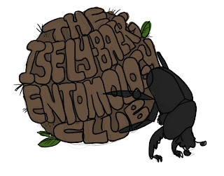
The Isley-Baerg Entomology Club wanted a t-shirt design. While doing some mundane task, I came up with an idea. What if we had a dung beetle pushing a ball of dung that had the club name in it? BRILLIANT!
So I sat down in front of Photoshop, looked at a reference picture and drew a sketch. The typography is laughable, but it gets better later. I hand drew the letters, give me a break.
Then I gave it a rough outline and slapped some color on it.

After submitting this draft to a bunch of graduate students, I noticed that the text wasn't right. It should be curved the OTHER way if we are viewing this from the perspective of the beetle. I later fixed this.
So, I wanted to make this in Illustrator. Using the File > Place feature I inserted the Photoshop draft into Illustrator. I later deleted it since I realized I had to do something new with the text, because I just wasn't feeling it. The draft was okay but definitely not material I would put on a t-shirt (yet).
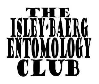
So, I chose a text that was bold and fat and typed out THE ISLEY-BAERG ENTOMOLOGY CLUB. I used the free transform tool to get the text to look vaguely like a ball.

So, I made the text into a symbol. I planned on mapping the symbol to the face of a 3D sphere. It took me nearly my entire life to figure out how to make a sphere using Effects > 3D > Revolve.
I have left the path intact for you to view. By drawing a half-circle path that curves outward to the RIGHT, you can get a sphere using the Revolve tool. View my first sad attempts below. I got a lot of things that looked like tornadoes.
After making a successful sphere and mapping the text to its surface, I drew a circle behind it (roughened the circle to make it look more poop-like) and adjusted the opacity....
...then I began to trace the letters.
Using different brushes and colors, I achieved a dirty effect.
I also skipped a few steps.
I used my dung beetle from the Photoshop sketch. I placed it into Illustrator via File > Place and used the Live Trace feature to convert the beetle into vector paths. I then used the Live Paint tool to color the sections of the beetle. I added a lighter gray for highlighting.
I also added several tiny brush strokes to the dung ball to make it contrast the text.


No comments:
Post a Comment